link roundup
Link roundup for September 2017
Best repurposing of a conference poster for the month goes to Wendy Yoder:
(For something on this Internet, this blog has not had enough cats.) Hat tip to Colin Purrington.
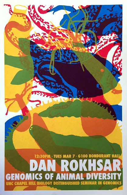
A collection of awesome seminar posters at University of North Carolina Chapel Hill. I may have featured these on the blog before... but there have been more since then, so it’s worth revisting.

Yun Tao (via Holly Bik) observed:
Hat tip to Jenny Merritt and Dr. Becca.
Quote of the month from Benjamin Mazer:
Sparklines are mini graphs inserted into text, created by Edward Tufte. Now it’s easier than ever to create them with a special typeface. It’s called ATF Spark. Hat tip to Dr. Becca.
Typography jokes:
Hat tip to Janet Stemwedel.
If you have anxiety about attending conferences, try this post from the Where There Is Light blog:
Graphic design appears in a New Scientist feature, of all places. It’s a review of a Wellcome Collection exhibition, “Can Graphic Design Save Your Life?” The exhibition is feature on the Wellcome Collection website.
This is a tribute to the joy of using something well designed and well made. In this case, nail clippers.
Rounding out the month with this quote from Sophia Wassermann:
Me too, Sophia. Me too.
(For something on this Internet, this blog has not had enough cats.) Hat tip to Colin Purrington.
A collection of awesome seminar posters at University of North Carolina Chapel Hill. I may have featured these on the blog before... but there have been more since then, so it’s worth revisting.

Yun Tao (via Holly Bik) observed:
Our current crappy seminar posters (word doc, comic sans) trivialize the gravitas/seriousness of seminars.
Hat tip to Jenny Merritt and Dr. Becca.
Quote of the month from Benjamin Mazer:
“So you have to make a poster for the science fair? Didn’t you do that in elementary school?” – my mother, clearly not an academic.
Sparklines are mini graphs inserted into text, created by Edward Tufte. Now it’s easier than ever to create them with a special typeface. It’s called ATF Spark. Hat tip to Dr. Becca.
Typography jokes:
Hat tip to Janet Stemwedel.
If you have anxiety about attending conferences, try this post from the Where There Is Light blog:
This is a really difficult thing for anxious people, because new things are scary and we love to overthink and play out every worst-case scenario in our head beforehand. However, I know from experience that it is highly unlikely that any of these scenarios will ever become reality and what also helped me is to approach anxiety as excitement and chances for bravery.
Graphic design appears in a New Scientist feature, of all places. It’s a review of a Wellcome Collection exhibition, “Can Graphic Design Save Your Life?” The exhibition is feature on the Wellcome Collection website.
This is a tribute to the joy of using something well designed and well made. In this case, nail clippers.
This nail clipper was forged, not stamped out of cheap sheet metal. It wasn’t just forged, it was forged well, with machines without any rattles or squeaks, and probably inline measurement of temperature to keep the steel exactly hot enough. I don't know how to explain the shock of seeing such a skillfully forged nail clipper to someone not in the metalworking industry. It was like seeing a dog with six legs, or opening up a lawnmower and seeing the jet engine from a 747. Nail clippers simply aren’t forged, nobody puts that much thought and quality into tools for trimming nails. ...
I took off my other shoe and sock, and trimmed those nails unnecessarily, just for an excuse to keep using this wonderful tool, all the while wondering “What is wrong with me? Why am I enjoying this chore of trimming my nails, when I could be out skiing?” That’s how amazing those clippers were.
Rounding out the month with this quote from Sophia Wassermann:
Posters: my favourite part of a conference cause of all the people & research you can see.
Me too, Sophia. Me too.


0 Kommentare