critiques
Critique: Bugs and beans
Desi Quintans was kind enough to contribute his EcoTAS 2017 poster this week. Click to enlarge!
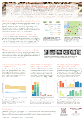
This is a sweet poster that I like a lot.
It is not crowded; there is plenty of white space to separate everything.
The use of wide margins and a few subtle reinforcing lines make the reading order clear: you read this across in rows.
There are plenty of different colours. Even though there are lots of primary colours (red, blue, green, and so on), they are low key enough that the colours are not competing with each other. Instead, it feels very harmonious. The colours are used not just in the figures, but in the headings to make them pop and reduce the “greyness” of the text.
There is only one place where I feel there was a missed opportunity. Unfortunately, it’s a critical one. It’s the title.
The culprit is the photo background. The photo and the title are in the same orange to brown colour range. By making the text box transparent to let the photo show underneath, the contrast between the text and background is reduced so much that the title is practically camouflaged from a distance. Even usual tricks like making the title bigger or bolder would probably not be enough to make the title stand out from a distance. That being said, the title could stand to be both bigger and heavier.
I also love the idea of the one sentence take home underneath the title. Again, though, the photo background robs the idea of the win by hiding the text.
Speaking of the title, Desi wrote:
Desi’s point is a good one: abstracts are submitted so far in advance that nobody expects them to be reflect what is on the final poster perfectly. While there is a case that changing the title might cause confusion, I think people usually find poster by the numbers of the posterboard. Changing a title probably does not make it difficult to find.
Related posts
Your title is 90% of your poster
This is a sweet poster that I like a lot.
It is not crowded; there is plenty of white space to separate everything.
The use of wide margins and a few subtle reinforcing lines make the reading order clear: you read this across in rows.
There are plenty of different colours. Even though there are lots of primary colours (red, blue, green, and so on), they are low key enough that the colours are not competing with each other. Instead, it feels very harmonious. The colours are used not just in the figures, but in the headings to make them pop and reduce the “greyness” of the text.
There is only one place where I feel there was a missed opportunity. Unfortunately, it’s a critical one. It’s the title.
The culprit is the photo background. The photo and the title are in the same orange to brown colour range. By making the text box transparent to let the photo show underneath, the contrast between the text and background is reduced so much that the title is practically camouflaged from a distance. Even usual tricks like making the title bigger or bolder would probably not be enough to make the title stand out from a distance. That being said, the title could stand to be both bigger and heavier.
I also love the idea of the one sentence take home underneath the title. Again, though, the photo background robs the idea of the win by hiding the text.
Speaking of the title, Desi wrote:
I regret the generic title of my poster, but it’s what I gave to the conference before I even knew what I’d be presenting. The conference materials were already printed by the time I came up with the poster. In hindsight, no one cared about my title in the printed abstract and I should have gone ahead and changed it anyway.
Desi’s point is a good one: abstracts are submitted so far in advance that nobody expects them to be reflect what is on the final poster perfectly. While there is a case that changing the title might cause confusion, I think people usually find poster by the numbers of the posterboard. Changing a title probably does not make it difficult to find.
Related posts
Your title is 90% of your poster


0 Kommentare